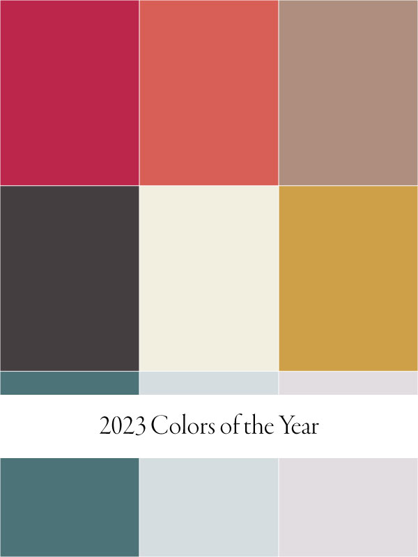
Every year, we look forward to the color of the year announcement from industry leaders like Pantone, Behr, and Sherwin-Williams. These distinguished colors inspire us with new ways to style homes using Saffron Marigold linens and small interior design elements. You don’t need to make any new purchases, either, when revamping a space or room save for a bucket of new color or a roll of wallpaper. More often than not, you already have a few pieces tucked away in storage you can unpack for a room overhaul.
Without further ado, here are the 2023 color of the year recipients (so far), plus styling ideas using Saffron Marigold items and more. Happy designing!
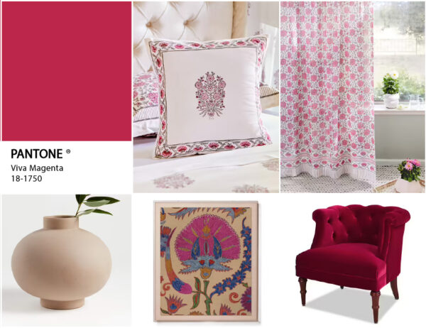
1. Pantone – Viva Magenta Color the Year
Kicking off our color of the year 2023 list is Pantone’s electrifying shade from the red family known as Viva Magenta 18-750. It’s especially fitting for those with “the same verve for life and rebellious spirit” as it is “audacious, full of wit, and inclusive of all.”
Instead of a bright, orange-red or tomato shade, Viva Magenta leans towards a richer, velvety carmine red. Pantone’s inspiration behind the color is the design (and lifestyle) trend towards sustainability and wellness. Viva Magenta’s carmine red is derived from the cochineal beetle, and this natural origin signifies “a primordial signal of strength,” pushing us towards new ways of self-expression with confidence and bravery.
Styling with Viva Magenta
In design, too, Viva Magenta pushes us to make bold statements without restraint. Since it is such a saturated color, you might prefer it in small doses as an accent color. Perhaps in an armchair or wall hanging. Complement with linens from our Dahlia Daydreams collection, which features an equally stunning color: raspberry sorbet pink.
Get the look
 Dahlia Daydreams - CP ~ Pink Floral Romantic Throw Cushion Cover
 Dahlia Daydreams ~ Pink Floral Romantic Sheer Curtain Panels
 Dahlia Daydreams - CP ~ Pink Floral Romantic Window Valance
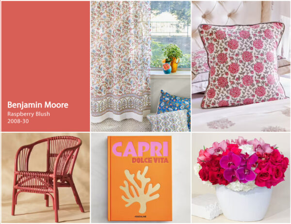
2. Benjamin Moore – Raspberry Blush
Raspberry Blush 2008-30 by Benjamin Moore is part of the company’s 8-color palette for 2023—each one transformative, distinct, and full of confidence. Raspberry Blush hails from the pink and red-orange family, urging us to be unapologetically bold. Benjamin Moore collaborated with musical duo Chromeo with this 2023 color of the year, and the resulting song of the same name underscores the “upbeat and optimistic tone of the palette.”
Styling with Benjamin Moore
Bursting with positivity, Raspberry Blush is an ode to what life has to offer, whether it be in design or music. Incorporate Raspberry Blush into a living room as a reminder to make the most of each day. That said, we totally see Enchanted ~ Ivory and Dahlia Daydreams as the perfect accompaniments to this delightful color of the year.
Get the look
 Dahlia Daydreams ~ Pink Floral Romantic Round Tablecloth
 Dahlia Daydreams ~ Pink Floral Romantic Throw Cushion Cover
 Enchanted - Ivory ~ Sheer Curtain Panels
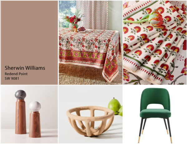
3. Sherwin-Williams for a neutral color of the year
While Pantone and Benjamin Moore’s colors of the year are electrifying, Sherwin Williams’ pick is all about subtlety and warmth. Redend Point SW 9081 is an evolution of the earthy color trends of recent years. With pinkish undertones, it reminds us of a sunset in the desert or a magnificent Arizona slot canyon.
Redend Point
“Inviting, calming, and versatile” are words Sherwin-Williams uses to describe Redend Point, and we wholeheartedly agree. This organic shade can be used for entire walls, cabinetry, and furnishings. No matter how much you decide to cover with this nature-inspired color, you won’t tire of it easily.
Styling with Redend Point
Sherwin-Williams recommends pairing Redend Point with a deep emerald or other earthy tones for a natural aesthetic. We can’t help but think of our Tropical Gardens collection with its verdant foliage, multicolor blooms, and rich apricot ground to bring out the best in Redend Point.
Get the look
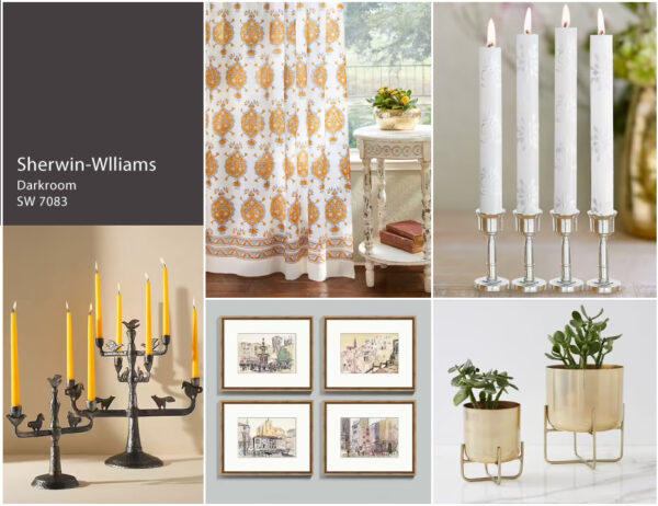
Bonus Color of the Year: Darkroom
Sherwin-Williams and HGTV also released a 2023 Vintage Homestead Color Collection of the Year, a revival of classic and vintage elements. Darkroom HGSW7083 is perfect for someone who loves romantic, heritage-style homes with a modern flair. This black has purple undertones, so while it is a dramatic color, it’s a fantastic neutral to use against lots of patterns and retro elements.
Styling with Darkroom
Darkroom is best used in a modern-traditional home, so this means symmetry, classic style elements, and old-style glamour. Speaking of old-school glamour, we highly recommend our Versailles print for a window treatment or table linen for styling this color of the year. Pick up a set of our hand-painted taper candles in white for an elegant touch.
Get the look
 Versailles ~ Yellow and Grey Medallion White Round Tablecloth
 Versailles ~ Yellow Grey Medallion Fleur de Lis White Curtain
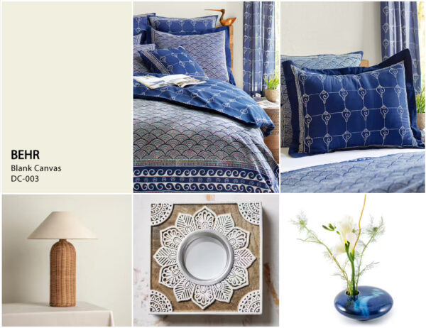
4. Behr – Blank Canvas
Behr’s Blank Canvas DC-003 is a lesson in versatile basics that help renew any room in the home. It’s a “faint ivory” and a warmer off-white alternative to icy white—a great choice for an entryway, bedroom, or home office that needs a bit of brightening up.
Styling with Blank Canvas
Use Blank Canvas as your base color; you can’t go wrong using it to revamp cabinets, wall panels, or mantels. Here’s how we envision Blank Canvas in a tranquil bedroom, most especially for Japandi style rooms. Our Japanese-inspired collection Pacific Blue also features a delicate ivory against a rich indigo blue sea.
Get the look
 ~ Rustic Navy Blue Ocean Oriental Pillow Sham") Pacific Blue (CP) ~ Rustic Navy Blue Ocean Oriental Pillow Sham
Pacific Blue (CP) ~ Rustic Navy Blue Ocean Oriental Pillow Sham Pacific Blue ~ Nautical Asian Indigo Blue Duvet Cover
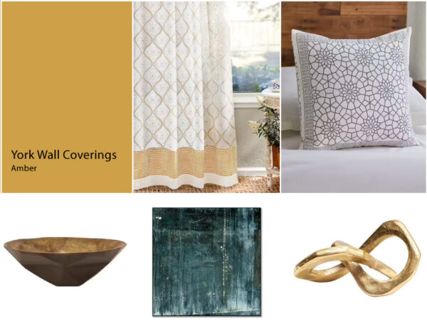
5. York Wall Coverings – Amber
If you’re in search of a color that will help with “absorbing negative energy and releasing bright, soothing energy,” try amber, according to York Wall Coverings’ color expert. Like an amber stone, an amber wall or piece of decor is associated with warmth, renewed energy, and inspiration. Part of their Elements 2023 Color Trends Palette.
Styling with Amber
Choose any amber wallpaper from York Wall Coverings, then accessorize with window treatments featuring prints like Vanilla Glace and throw covers like Royal Mansour for a fresh, clean aesthetic. Touches of gold and dark green speak to this warm color, too.
Get the look
 Royal Mansour Quartz ~ Moroccan Gray Trellis Toss Cushion Cover
 Vanilla Glace ~ White Gold Romantic Elegant Window Valance
 Vanilla Glace ~ White and Gold India Curtain Panel
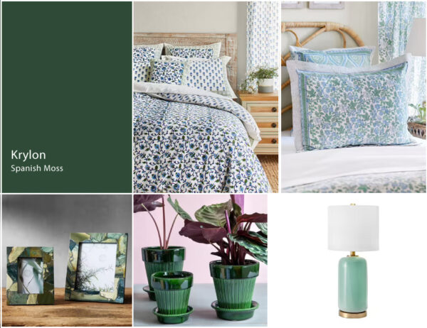
6. Krylon – Spanish Moss for a lush color of the year
In line with nature-leaning trends, Spanish Moss brings “the richness of nature, dense forests and mossy terrains” into your home, according to a Krylon Senior Color Designer. This midnight green shade feels luxe, inspirational, and fresh.
Styling with Spanish Moss
Since it’s a deep green, it pairs well with colors in either the cooler and warmer ends of the spectrum. Moonlit Taj with its jewel-toned palette and Woodland Ferns with its blue and green flora and fauna are fitting for Spanish Moss.
Get the look
~ Exotic Turquoise Floral Euro Pillow Sham Cover") Moonlit Taj (CP)~ Exotic Turquoise Floral Euro Pillow Sham Cover
Moonlit Taj (CP)~ Exotic Turquoise Floral Euro Pillow Sham Cover Moonlit Taj ~ Blue and Green Floral India Duvet Cover
 ~ Botanical Print Pillow Sham Cover") Woodland Ferns (CP) ~ Botanical Print Pillow Sham Cover
Woodland Ferns (CP) ~ Botanical Print Pillow Sham Cover7. Dunn-Edwards – Terra Rosa
For something more muted, try Dunn-Edwards’ rosy pink Terra Rosa. While it embodies the delicate mood of blush pink, it’s a much deeper shade, thanks to a “touch of terra-cotta influence” and it exudes “confidence, creativity and coziness.” One idea for its use is to revamp burgundy walls or brown cabinetry.
Styling with Terra Rosa
Though saturated, Terra Rosa can be utilized as a neutral color. Go fun with bright accents that pop against this deep value pink. The key word here is bright, and we suggest a linen from our Moroccan-inspired Mosaique Bleue collection or Dreams of India collection. For a fun and unexpected touch, accessorize a shelf or dining table with our Berry Sorbet hand-painted taper candles.
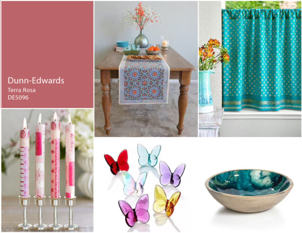
Get the look
 Mosaique Bleue - Earth ~ Moroccan Tile Print Blue Table Runner
8. Glidden – Vining Ivy for a nature-inspired 2023 color of the year
If you’re looking for a lighter member of the blue-green family, Vining Ivy is a fine choice. It’s great for a micro-luxury vibe, and works particularly well for a more modern aesthetic. A coastal-themed room is also a no-brainer when using this brother to seafoam green.
Styling with Vining Ivy
Since Vining Ivy can be more blue or more green (up to you!), your decor choices are vast. Glidden recommends pairing this bluish-green with dark-toned woods and off-white trims. Here’s one idea: Our Casablanca Blues lightweight bedspread print is equally invigorating, as well as the white-on-white complementary print to Royal Mansour.
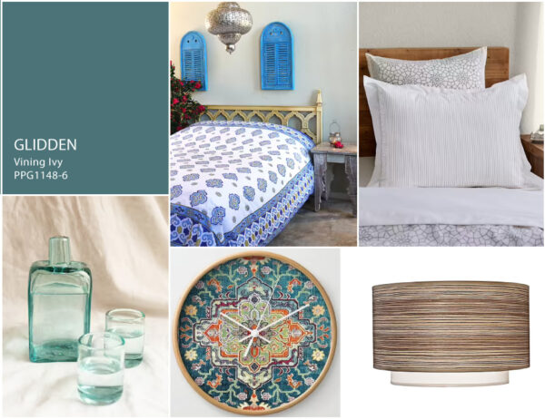
Get the look
 Royal Mansour ~ White Pillow Sham
8. Valspar for a soft and delicate 2023 color of the year
Valspar released a collection of colors for 2023, recognizing them as “beautiful, livable, and ready-to-go-shades” for any room makeover. We chose two toned-down pastels to feature in our 2023 colors of the year lineup.
Rising Tide
We elected Rising Tide for its soft, yet rejuvenating qualities. It’s a pastel blue that isn’t too opaque, which is a relief if you want to use it for a large space such as the living room or bedroom.
Styling with Rising Tide
Valspar suggests going the eclectic maximalism route with this gentle blue-grey. Mix and match materials, patterns, and colors, using Rising Tide as your anchor for a fun, unexpected arrangement. The blue and pastel designs in our Enchanted collections are a match made in heaven for Rising Tide!
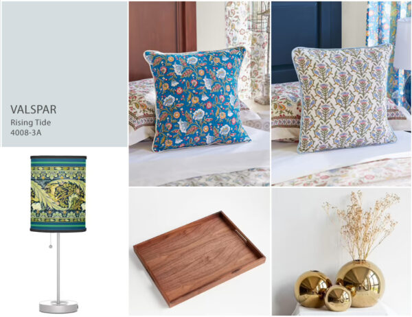
Get the look
 Enchanted - Blue ~ Throw Cushion Cover
 Enchanted - CP ~ Throw Cushion Cover
 Enchanted - Ivory ~ Throw Cushion Cover
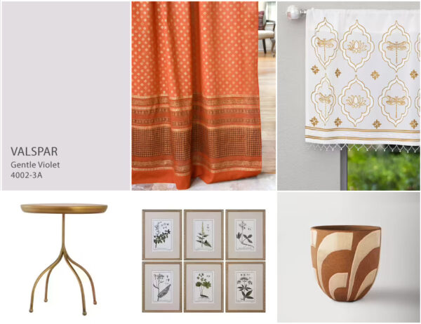
Gentle Violet
Gentle Violet isn’t a common color found in nature, but according to Valspar, it pairs wonderfully with colorful naturals. This light purple tone represents the blurred line between natural and artificial colors, and we can see why it’s a 2023 color of the year. It’s a nod to the past, present, and future not just in design, but in lifestyle trends.
Styling with Gentle Violet
Orange is a complementary color to violet, so we can confidently recommend our Shimmering Goldstone (a rich, rust orange) curtain panel in a living room painted with Gentle Violet. In the kitchen or bathroom, the gold and white Dragonfly Lotus window valance will shine against this soft purple shade. Then, we would arrange wooden and gold or brass-toned pieces throughout for an organic feel.